If you've been reading about the latest in CSS, you might have read about flow-root. Flow root establishes a new block formatting context, but most have dismissed it as simply replacing clearfix hacks. But consider this extremely common case, where you have a few paragraphs of text, some bullet points and a floating image:
As you can see, this mostly works, the above uses the following CSS:
img {
  width: 33%;
  height: auto;
  float: left;
}
So far so good, but what about the weird indentation of the bullet points? Turns out there's no trivial way to fix this! margin-left on the ul or li's won't work. padding-left won't work either. So what's up with that?
Unintuitively, when you float an element, it doesn't actually modify the bounding box of adjacent elements (try hovering via DevTools):
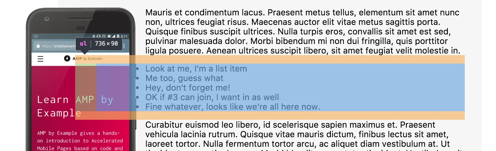
However, the actual text content, including inline elements, gets “correctly” pushed to the right. If you wanted to indent the bullets further to the right, you could set the left margin to a high-enough value that matches the width of the image, but then you'd need to be sure there's always an image there – not optimal.
OK tell me how to fix it
I'm glad you're asking. The obvious answer is to simply use flow-root:
ul {
  display: flow-root;
}
But flow-root isn't widely supported in browsers yet. There are 4 ways I found to deal with this scenario, some better than others. All establish new block formatting contexts, and need to be applied to the <ul>:
- Use
display: inline-block. Kinda works, but only if your<li>'s don't have wrapping text, which is hard to guarantee. - Use
overflow: hidden. Works great, but only if your list doesn't have elements positioned outside of its bounding box. - Use
display: table-cell. Works great, but...ugh tables? Found out via Nicoles 2010 blog post. - Use
display: flex; flex-direction: column;. Works great, but specific to the list use-case.
Try the different methods via DevTools in the Codepen above and use the one that best suits your needs.
So if these work, why bother waiting for flow-root? flow-root exists so your CSS better expresses the intention of the developer. Chances are you won't remember a year from now why you styled your <ul> as display: table-cell.