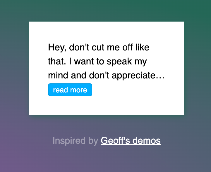
TL;DR: I built a CSS-only (~ish) solution for multiline truncated text with read more button.
The other day, truncated text came up during a discussion in the office, and I since wondered if CSS has come far enough to be able to do truncated text right, that is, supporting the following:
- Multiple lines
- "Show more" button that expands text when clicked
text-overflow: ellipsis does not support multiple lines, but I remembered the line-clamp property that can be used to achieve multiline truncated text. And luckily, CSS Tricks has a nice working demo, plus browser support is fairly decent now. Cool!
What about that expand button though?
Creating the "show more" button requires some outside-the-box CSS hackery. I couldn't use a <button> or <a> tag, as this is a job for the infamous checkbox hack, and that required a label element and an accompanying...checkbox! So I ended up with the following markup:
<div class="box">
  <input type="checkbox" id="expanded">
  <p>Hey, don't cut me off like that. I want to speak my mind and don't appreciate being put into a box.</p>
  <!-- Note: I have sadly not found a nice way to put the more button/label inline inside the paragraph, after or before the ellipsis. -->
  <label for="expanded" role="button">read more</label>
</div>
Since I put the checkbox right before the paragraph, I could now use the :checked pseudo class to toggle truncation, like so:
input:checked + p {
  -webkit-line-clamp: unset;
}
And indeed, this did exactly what I wanted: Click the button, and the paragraph toggles between truncated and not truncated. Sweet.
But..but...but it's a hack, what about a11y??
Indeed, the checkbox hack isn't only hacky and semantically problematic, it's also not very accessible, as most just naively display: none the checkbox. That results in broken keyboard navigation, as you cannot tab into a hidden the checkbox, and tabbing into the label doesn't help, as the space/enter keys don't forward the event to the checkbox like the click event does (this makes sense, as on a typical form, you would tab into the checkbox instead of the label).
I want my examples and demos to be as accessible as possible, so to solve for this, I first made the checkbox focusable/tabbable while still invisible, like so:
input {
  opacity: 0;
  position: absolute;
  pointer-events: none;
}
The only remaining issue was that I could now tab into the checkbox, but I had no way of knowing, without a screenreader, whether the checkbox is focused or not as...well...it's invisible. To solve for this, I made the label receive a (roughly) browser-default focus styling when in fact the checkbox is focused:
input:focus ~ label {
  outline: -webkit-focus-ring-color auto 5px;
}
Check out the combined demo, try clicking the button and try tabbing to it with your keyboard and hit the space key!
What if I don't know whether the text gets truncated or not? How do I show the button dynamically?
I tried was to find out what I can do to either show the button dynamically when the arbitrary text in the paragraph is too long to fit into the box, and hide it otherwise. Unfortunately, that's the one feature I just couldn't do with CSS, because it requires a :truncated selector, so that we could do something like this:
.read-more { display: none; }
p:truncated + .read-more { display: block; }
Turns out others had the same idea, but the discussion from 2014 didn't go anywhere. Boo! If you really need that feature, consider using JS for this until browser support comes around, like so:
const ps = document.querySelectorAll('p');
const observer = new ResizeObserver(entries => {
  for (let entry of entries) {
    entry.target.classList[entry.target.scrollHeight > entry.contentRect.height ? 'add' : 'remove']('truncated');
  }
});

ps.forEach(p => {
  observer.observe(p);
});
And here's the expanded demo with the JS helper and a resizing box (open in Codepen and resize the browser window to see the behavior):
Enjoy, and thanks to Geoff Graham for the line-clamp info and demos!


Member discussion