TL;DR: I did a thing with Flexbox. Here's the CodePen.
A couple days ago I was asked to create a the a page for AMPProject.org that would display our roadmap. Which I did. It looks like this:
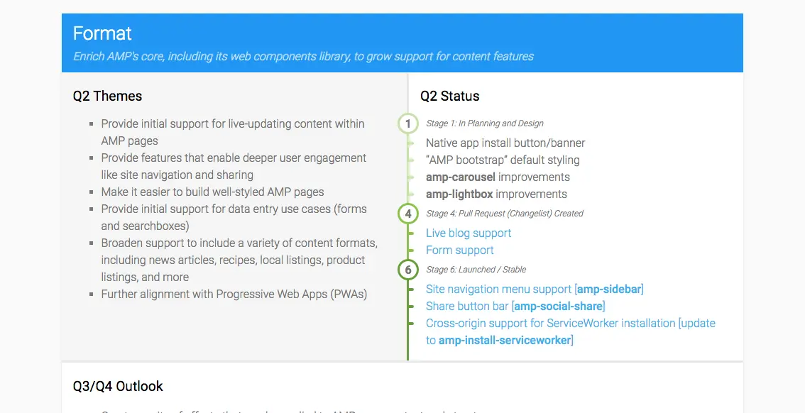
In order to make this design fully responsive, the step-based list showing the various stages of development needed to grow with the outer container. Here's an animation to visualize the behavior:
I solved it, of course, by utilizing Flexbox. But first, I wanted to support very simple, no frills markup, like so:
<ol class="steps">
  <li data-description="Step 1 description">
    <ul>
      <li>Substep 1</li>
      <li>Substep 2</li>
      <li>Substep 3</li>
    </ul>
  </li>
  <li data-description="Step 2 description">
    <ul>
      <li>Substep 1</li>
      <li>Substep 2</li>
    </ul>
  </li>
</ol>
I won't go too much into detail, but here's an excerpt of the CSS where the magic happens (I removed all visual styling), with comments that describe why something is needed and what's going on:
.steps {
  ...
  /* enable flex, wrap all items.
   * - align-items' and align-content's default are set to 'stretch',
   *   so li's automatically evenly distributed and stretched
   */
  display: flex;
  flex-wrap: wrap;
  ....
  /* alternative to built-in list style that we can style */
  list-style-type: none;
  counter-reset: steps;
}

/* the steps (li) */
.steps > li {
  ...
  /* gives items an explicit width, so we do things like
   * like ellipsis in overflowing text..
   */
  flex: 1 1 100%;
  ...
  border-left: 3px solid;
  counter-increment: steps;
}

/* the smallish description label next to the bubble */
.steps > li::before {
  /* show number + description from attribute in heading */
  content: "Step " counter(steps) ": " attr(data-description);
  ...
}

/* the bubble with the number in it */
.steps > li::after {
  ...
  /* show the number from the counter in the pseudo element */
  content: counter(steps);
}
Flexbox is often described as scary and difficult to grasp, but this I think is a decent example of how to use the defaults of Flexbox to your advantage. In fact, the only flex property we really need is the display: flex; and it just magically works. Everything else is smart styling, pseudo elements, counters etc.
And here's the end result: