If you could take a 50% hit in real world performance and get a site that feels 50% faster, would you?
For years, my colleagues and I have been working on convincing developers that faster websites are better websites. That's not what this article is about. I'm not going to give you stats about how much more money companies make that optimize for performance (they do). Make yourself comfortable, grab a cup of chocolate and join me on a journey through time.
Actual time vs. perceived time
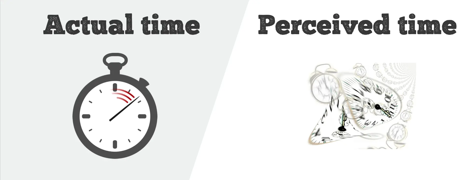
Measuring performance properly is incredibly complex. To demonstrate, let's try to measure the load time of a page. Pick one of these metrics:
- Time to first paint (automatic)
- Time to first useful paint (manual)
- Time to first viewport (semi-manual)
- Time to interactive
- Page load
Will you decide to measure absolute performance (page load) or perceived performance (TTFP, TTUP, TTFV, TTI)? During my research about how humans perceive motion, trying to explain why higher fps are better than lower fps, I quickly had to learn that a lot of things that I previously thought of in black and white really aren’t. Motion perception is an incredibly complex topic, highly subjective in some ways and a large part of what you’re think you’re seeing, you well...actually don’t, as most of it is generated in the brain.
Turns out the perception of time and speed is as twisted as motion perception, if not more. Similar to my Illusion of Motion article, Denys Mishunov wrote an excellent series on the perception of time on Smashing Mag that I can highly recommend as a primer.
Perceived performance is so important, even Apple writes about it in their developer guidelines:
“The perception of performance is just as effective as actual performance in many cases” (Basic Performance Tips)
Perceived reality – How our brain constructs the past, present and future
The way our time perceives time is dramatically different from the time that we measure with a stopwatch. Time is a highly abstract concept for humans. We can’t deal with it very well. Heck, we’re not even capable of living in the now!
Present
“we are all living in the past: Our consciousness lags 80 milliseconds behind actual events. When you think an event occurs it has already happened," says David Eagleman, neuroscientist. Yes, our brains have a time buffer!
This time buffer exists to synchronize the stuff that happens in our body, most of which are chemical processes that take a considerable amount of time. If you kick a ball with your foot, you perceive the sensation of touch and the visuals of the foot touching the ball at the exact same time, but they are considerably out of sync. The eye is physically much closer to the brain, and gets the signal much quicker. For that reason, the brain continuously waits for activity and aggregates for 80ms at a time. Without that buffer, our world would be maddeningly out of sync.
Unfortunately, the 80ms time buffer plays all sorts of perceptional tricks on us. From Scientific American:
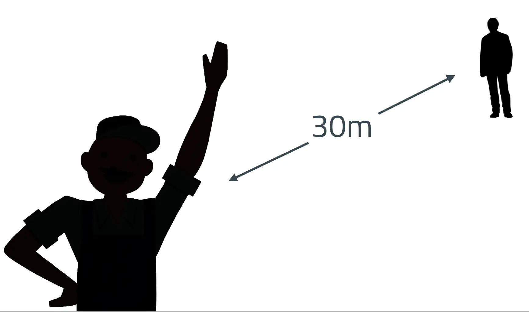
As long as a hand-clapper is less than 30 meters away, you hear and see the clap happen together. But beyond this distance, the sound arrives more than 80 milliseconds later than the light, and the brain no longer matches sight and sound. What is weird is that the transition is abrupt: by taking a single step away from you, the hand-clapper goes from in sync to out of sync. Similarly, as long as a TV or film soundtrack is synchronized within 80 milliseconds, you won't notice any lag, but if the delay gets any longer, the two abruptly and maddeningly become disjointed. Events that take place faster than 80 milliseconds fly under the radar of consciousness. A batter swings at a ball before being aware that the pitcher has even throw it.
For a practical example, consider day trading. A business where thousands of decision are made each day in matter of milliseconds. Because we don’t experience the now, we’re simply too slow to make decisions, which is where algorithms come into play. Computers might not always be smarter, but they’re definitely faster. Which is why high frequency traders paid $300m for a private transatlantic cable to shave off 5ms.
Past and Future
But it's not just the Present that we're having trouble with. Crazily, studies have shown that our whole concept of future is dependent upon being able to draw from memory and visualize the past. People who cannot recall long term memories cannot envision the future.
And our memories are highly subjective and volatile: Henry Roedinger, who studies metacognition:
When we retrieve a memory, we also rewrite it, so that the time next we go to remember it, we don't retrieve the original memory but the last one we recollected. So, each time we tell a story, we embellish it, while remaining genuinely convinced of the veracity of our memories.
Alright, let's better not think about cherished memories all to often so they stay fresh. How about short term memory though? Here too, there are some oddities, the way we perceive passed time is somewhat counter-intuitive:
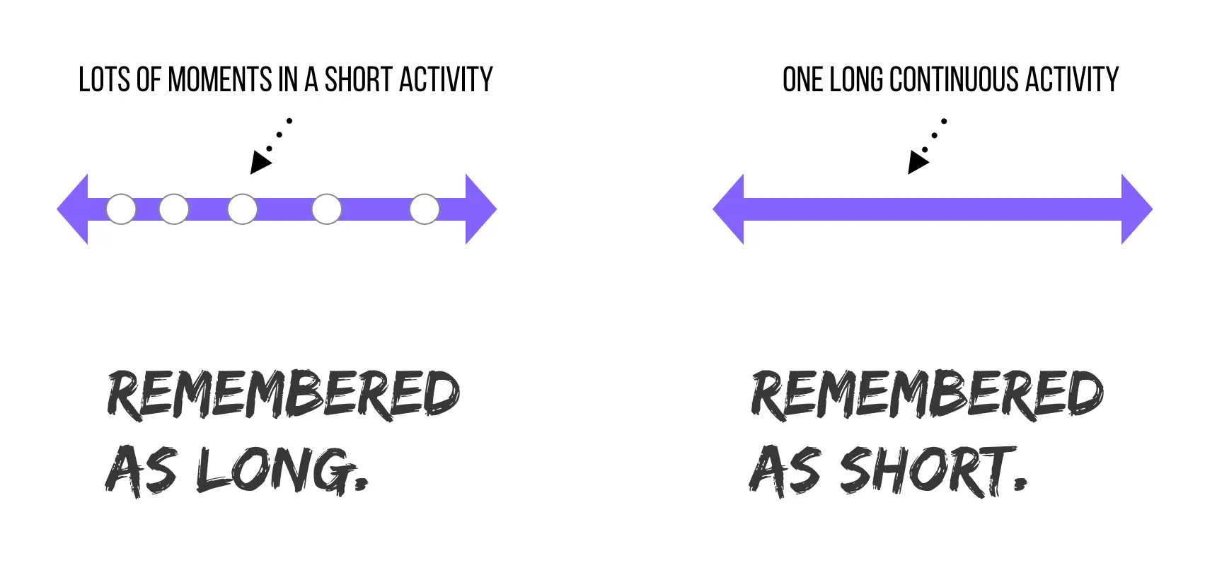
- Events where nothing happened are remembered as short
- Events that were fun and engaging but short are remembered as long
To make sense of this, visualize your "memory storage" as compressed storage. Your brain compresses long events like a long, unmemorable road trip since memories about all the license plates you've seen would be pretty redundant and useless. As a side effect, we later on perceive the passed time as much shorter as it has been.
Absolute targets for relative perception
So we’re pretty bad at being a steady clock. Still, we’re always trying to come up with hard numbers, like these coming from RAIL, the performance model that the Chrome team came up with (before it was replaced by PRPL):
- 60fps as animation target.
- 1 second load time.
- 100ms reaction time.
For a long time, we thought that the optimal numbers are hard wired. Let’s take a look at what happens when you wait for something:
- 100-200ms – Instant
- < 1s – Immediate (Delays noticeable but tolerable)
- < 5s – Part of user flow
- < 12s – Attention span
Some of these numbers are fairly reliable, but it turns out the last one, the attention span, isn't: The average transient attention span (focussed attention can be much longer) of a human dropped from 12 seconds in 2000 to 8.25 seconds in 2015! Thanks a lot, MTV.
Context is everything
We so far established that we suck at being a clock. But our perception and expectations also vary wildly depending on the current context and situation.
Say we're waiting for something to finish, and the easiest example might be the load of a website. As we just learned earlier, the ideal perceived load time might be around 1 second. But like everything we've already looked at, it isn't quite that simple! The context matters more than you think:
- Are you at a bus station?
- On a run?
- In a restaurant?
- On the couch at home?
- At the beach?
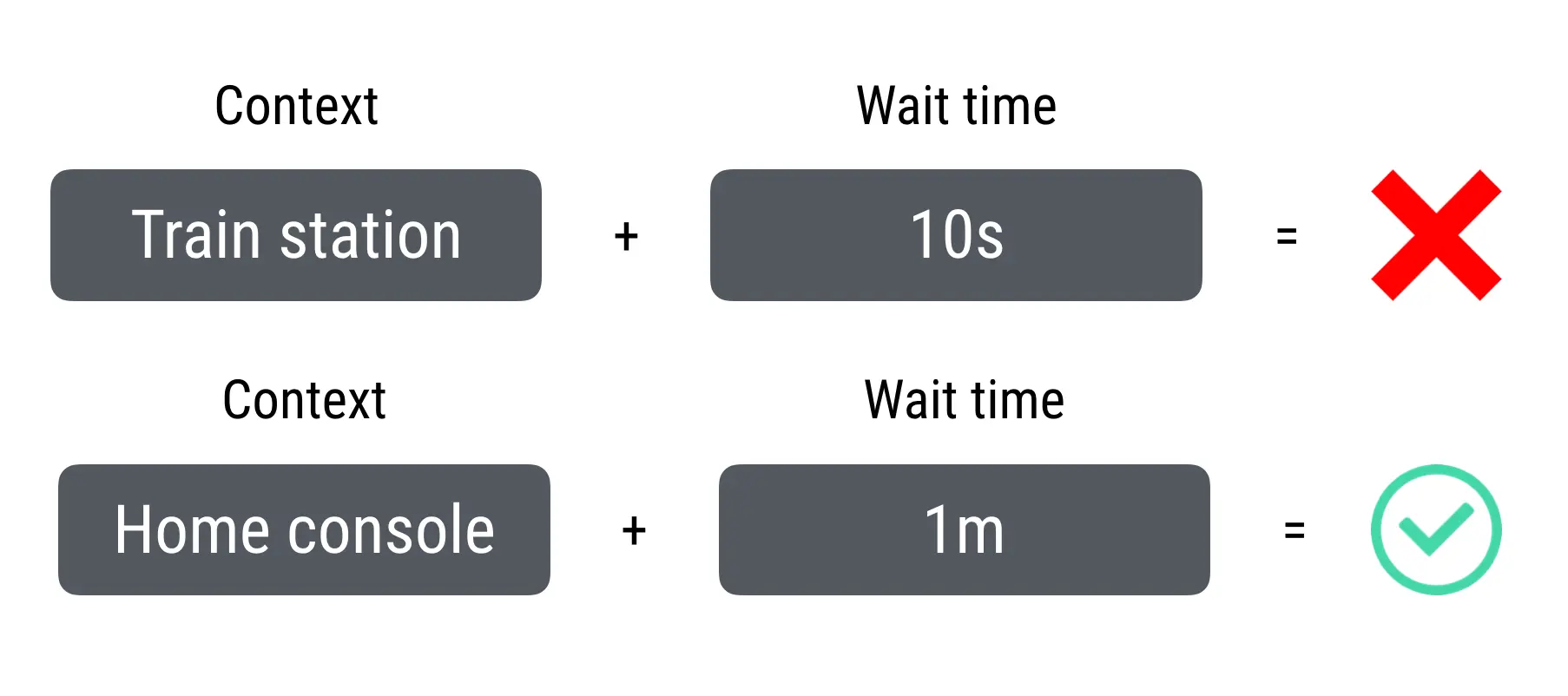
Not sure about you, but I'll never wait 10 seconds at a bus station for a page to load. But when I'm home and turn on my game console, I'm more than happy to wait a minute to boot up my game. Why? Because I'm already on my couch, I already decided that I'll play for 2-3 hours, so the ROI for waiting a minute is very high compared to an article page that I wait 10 seconds for, only to skim it for 20 seconds.
Now let's construct another example scenario using time, in this case 5 seconds. Compare these two scenarios:
"It takes 5 seconds to switch channels on my TV."
That's way too slow!
"This guy made me a burrito in 5 seconds."
That's way too fast! There's no way he made you a burrito in 5 seconds. That thing was pre-made!
Too fast?
Wait. Here I am, talking about performance, and claim that something was too fast?
In addition to the Burrito example, imagine asking someone a complicated question and getting a reply almost immediately. You'll start to wonder if she actually listened to what you had to say. Sometimes speed decreases the value of a service:
- "If something is fast, it must be easy"
- "If something is easy, it must be cheap"
Longer wait times can also build up anticipation and are an important dramatic element, especially when creating – OMG buzzword alarm – narrative-driven experiences. So when are things too fast? Here are some examples:
- Coinstar: Apparently, Coinstar's automated coin counting machines can total up the value of coins way faster than people believe, so to avoid skepticism they added an artificial "calculating" delay to increase believability (source).
- Locksmiths: Tragically, locksmiths get penalized for getting better at their profession. They get tipped better as apprentice, when it takes them much longer to pick a lock, as the customer perceives the service as more work, and thus more valuable.
- Blogger: From a reddit comment by Kareem Mayan:
I attended a "Redesigning Blogger" workshop in 2004, when Jeff Veen at Adaptive Path and Douglas Bowman (of stopdesign.com, now with Twitter) talked about their experiences redesigning Blogger. One of the things they found in user testing was that when new users clicked "Create my Blog" on the last step of the setup process, they were confused at how quickly their blog was created. "That's it? Is something wrong?" were the types of things people said. So they added an interstitial "Creating your blog..." type page that did nothing but spin a little animated gif and wait a few seconds before sending new users to the "Yay, your blog is created! page". Users were far more satisfied with the new experience that took longer.
Let's compress
Equipped with the above knowledge, we can now manipulate time – yes, even without a flux capacitor, as we're merely influencing the perceived duration. To start, we need to understand the active vs. passive wait phases.
Active vs. passive waiting
Waiting feels less like waiting as you're actively engaged. This is what we call the active phase, with the other being called passive phase. Time is perceived as much longer in the passive phase. One way to improved perception then is to shorten the passive phase, and lengthen the active phase, either via:
- Preemptive start – Start work before the user realizes it.
- Early completion – Show stuff to the user before all of it is ready.

Denys goes in-depth about these two techniques in his blog posts, so check them out afterwards. But I'm going a little further and am adding three additional techniques to our toolbox:
- Optimistic UI – Showing an action as completed that hasn't.
- Prediction – Predicting a future outcome before it happens.
- Visual Illusion – Sometimes, e.g. in form of an animation, enough to change time perception
Turning theory into practice
Preemptive start
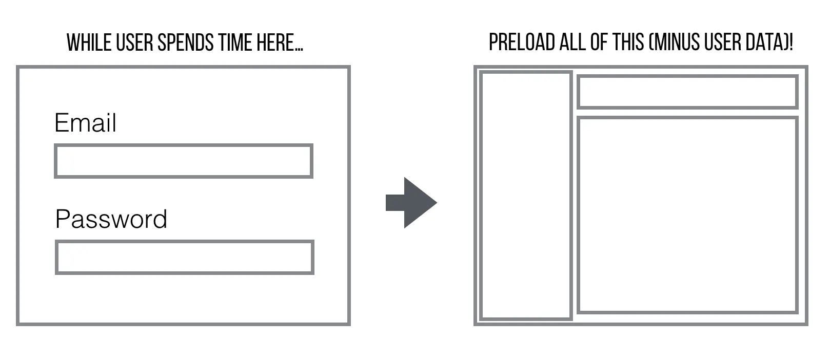
iOS runs a zoom-in animation while the app loads, making it seem faster than it does, as the action is started preemptively, before any of the app can be shown. Then there's predictive fetch: Safari fetches sites it thinks you'll likely click on in advance ("Top Hits"), and so does the Top Stories Carousel in Google Search. And if you want to collect bonus points, you implement multi-step preload techniques throughout your site: In a multi step form or process, one can almost always predict and preload the next step while the user is busy doing something else. Think login form, e-commerce checkout or installing a Service Worker.
Early completion
Good examples of things that seem to complete earlier than they actually do are both lazy loading and video buffering. Showing a skeleton UI before filling in content feels faster than showing it all at once, and progressive images profit from the same phenomenon. When you click on an online video, it starts playing back before the entire video is ready, creating the illusion that it loaded faster.

Optimistic UI
Instagram always pretends to work. Clicking the like button always "works", even when you're temporarily offline. Instagram gives you a promise that what you intended to do will happen, eventually.
One word of advice with optimistic UI's: Lies are great if you aren't caught. A little white lie can turn into a problem if you break your promise. If for whatever reason you'd stop using that device after entering a tunnel, then later found out from another computer that none of the likes went through, you'd feel cheated.
Prediction
One could argue that prediction is a variation of preemptive start, but it's not about moving the active/passive needle, but instead overcoming things like hardware limitations in a purely active phase. A powerful example is a metric called glass time, which describes the latency between your finger touching a touch screen, and how long it takes for the visual feedback to arrive on screen. Even under the most optimal solutions, there'll be a delay of at least 16-32ms of glass time due to the 60Hz refresh rate of most consumer screens.

This is why both Microsoft (starting with their Surface tablets) and Apple (starting with iOS 9.1 and the Apple Pencil) have invested heavily in predictive touch, which is exactly what it sounds like: The ability to predict the future position of your finger.

Of course, the use cases for prediction are limited to situations with high probability of an outcome, but when it works, it's magical. To prove that your Surface predicts movement, try panning something with your finger, then stop abruptly, and you should see a tiny re-bounce/correction.
Visual Illusion
Sometimes visual illusions are all you need. In the world of animations, the right easing can dramatically influence how an animation is perceived. Linear easing often feels the slowest, compared to "ease out" and "ease in":
- Ease out works because deceleration feels extremely satisfying as it occurs in the real world, and the visual “weight” is put on the first half of the animation. In fact, there are cases where easing is more convincing and powerful than active/passive phase manipulation: Momentum scrolling (as opposed to traditional scrolling) dramatically extends the passive phase, but the natural ease makes up for it.
- Ease in works because studies have shown that your emotional state and perception of the last moment of a longer activity determines how you remember it. So if you went to a concert and most of it was pretty meh, but the last song was amazing, you’ll have fond memories of it. For a longer animated progress bar, it’s therefore weirdly satisfying to see it speed up towards the end, and makes people think the whole task was shorter than it actually was.
It gets even more interesting if you take it a level further with a look at progress bars. Chris Harrison has found out that progress bars which pulsate increasingly quickly made download time seem shorter than those that pulsated increasingly slowly, and – I found this very surprising – downloads were also perceived faster when ripples in the progress bars moved to the left rather than to the right.
That doesn't mean you should add deceiving progress bars to all parts of your product. "The best progress bar is no progress bar", says Luke. For tasks that take less than a few seconds, consider using a transition instead.
Perceived speed is not a solved problem space
Time perception is an incredibly far-reaching and complicated subject, and I’ve tried my best to dive deeper than usual into the topic. But some problems are far less black and white and harder to solve. Consider the case of web browsers, that only unload the current page after the new page has started rendering. On the plus side, it makes the load of the next page feel faster than it actually is. But it regresses responsiveness, in that we don't get an immediate reaction upon link click. But when we reserve, we reverse the benefits and regressions! So what's the ideal solution? No one knows.
Thus I challenge you: Help me 'hack' the perception of time even further, and come up with your own research, studies and practical examples on how we can make everything feel fast. And keep this in mind when you think about your users:
Nobody cares how fast your site is. Just how fast it feels.
(Many thanks to Denys Mishunov and Tim Ansell, who helped prepare the outline for this talk and article!)



Member discussion